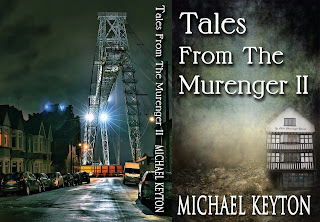
There’s a fair bit that goes into a book cover, but when it’s done, you feel a great sense of relief. The previous: Tales from the Murenger involved an original photo* of Newport’s iconic Murenger and enough smoke and mist to create a sense of nowhere in particular. The back cover necessitated similar wizardry turning an already mysterious alley into something more sinister.
But what about this new book: Tales from the Murenger II ?
I thought it made sense to make it much the same as the first but with a different shade. A series perhaps with the possibility of a future Tales from the Murenger III coloured blue. I'll draw the line at rose-pink.
In this case, however, I wanted a different back-cover and found it in a photograph from Stephen Pocock on the Facebook ‘We Grew Up In Newport’ site. Not only is he a brilliant photographer, he very generously allowed me to use his photo.
Below is the original photo with its sharpness and clarity. The bad news was that however hard I tried to persuade myself otherwise, it jarred with the more mysterious soft focus of the front. The good news is that precisely because of its sharpness, the photo could be softened and dimmed sacrificing clarity for mystery— the essence of Newport.
So, the cover for your approval or otherwise. (barcode to come.)
The book is already on Amazon, the tales as dark as they get.
* Front photo Monty Dart
Back photo Stephen Pocock.
Cover design Maria Zannini one of the the best in the business.


2 comments:
I've had to go through thousands of photos regularly and I was highly impressed with Stephen's work. That's one of the finest portfolios I've ever come across. You were lucky to find a kindred spirit as in love with the area as you.
You're right, Maria. I call Newport dark, seedy and magical - another way of saying fertile, creative and generous.
Post a Comment